
You’d Be Amazed by the Inspiration Behind The Logos of These Businesses
Business logos are everywhere– on clothing, phones, food, cars and so on. Some logos are incredibly straightforward or a pictorial representation while others are more complex. But one thing you can’t deny is that the meaning behind a logo informs an audience of what the brand is all about.
Beyond the fact that logos represent brands, many of them have a deeply rooted meaning hidden behind the symbol. Let’s consider some.
FedEx
The shipping company, FedEx’s logo is probably one of the most familiar logos in the world. Between the “E” and the “X,” a negative space forms an arrow. In an interview, the logo’s designer, Lindon Leader, said, “The arrow could connote forward direction, speed and precision, and if it remained hidden, there might be an element of surprise.”
LG
At first glance, the dark pink logo for LG Electronics looks like a winking face. But if you look a little closer, you’ll see the face’s “nose” is an “L”, the outline of the “face” is a “G” and the dot in the middle of the circle represent the Eye. LG’s logo represents the smiling human face.
Pinterest tied its logo directly into the social network’s core. While the hidden image might not be immediately obvious, it is certainly fitting for the platform. According to Michael Deal, co-designer of the Pinterest logo, the letter “P” doubles as a pin.
Toyota
This car manufacturer’s logo certainly encompasses more than meets the eye. Toyota said the three overlapping ovals symbolise the unification of the hearts of its customers and the heart of Toyota products. The background space represents Toyota’s technological advancement and boundless opportunities ahead. And impressively, if you look even closer at the overlapping ovals, you’ll see the word “Toyota” spelt out.
Microtraction
Microtraction funds smart, relentlessly resourceful founders who are building high growth, technology-driven businesses. The company opted for a blue colour because it signifies trust. The logo is an M as well as signifying twin peaks, indicating that startups are successful because they’ve conquered both peaks.
Amazon
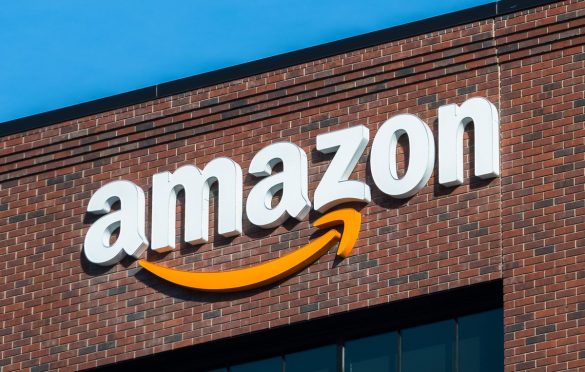
Amazon is a powerhouse when it comes to online shopping, and their logo reflects that. The yellow arrow in their logo starts at the letter ‘a’ and ends at the letter ‘z’, implying that they sell everything from a to z. The arrow also represents a smile, with the arrowhead being a stylised dimple or smile line. The smile indicates the happiness people feel when they shop with Amazon.
Picasa
Picasa, Google’s image organiser and editor, has an interesting logo mark. At first glance, it looks like a simple camera shutter, but the negative space in the centre of the shutter actually forms a house. This is because Picasa is considered home for all of its users’ photos, and casa in Spanish means home.
Unilever
Unilever created a “U” out of a variety of icons symbolising some of their core products. It’s a fun way to show they have their hands in a variety of areas and gives the viewer something to piece together.
Apple
One of the most recognisable logos in the world, the Apple logo is theorised to have come from none other than the story of Adam and Eve. The apple is supposed to be the apple Eve bit from in the Bible and represents the fruits from the tree of knowledge.
Another incredibly recognisable logo worldwide even after their recent redesign, Google’s logo is supposed to symbolise that they don’t play by the rules and know how to have fun. Google chose to relay their message with colour. They stuck with the primary colour palette but broke it with a secondary colour, green.
Flutterwave
With a mission to power a new wave of prosperity across Africa by enabling global digital payments Flutterwave’s logo is as simple as its complications. Flutterwave is a name its founders gave to a phenomenon known as the butterfly effect as depicted on the logo. This effect describes a natural occurrence where small changes in an ecosystem as little as the flap of a butterfly’s wings change the entire ecosystem. The yellow butterfly represents this effect which the company hope to have by building modern payments infrastructure to connect Africa to itself and the global economy.
Adidas
Adidas is a popular sports apparel and shoe company. Three stripes have always been a part of their logo, but in their most recent redesign, the stripes are staggered to look like a mountain. The mountain represents the challenges and obstacles athletes will face and overcome.
IBM
IBM’s famous logo is globally recognised. The white stripes passing through the letterforms give the illusion of equal signs in the lower areas of the letters, which represents equality.
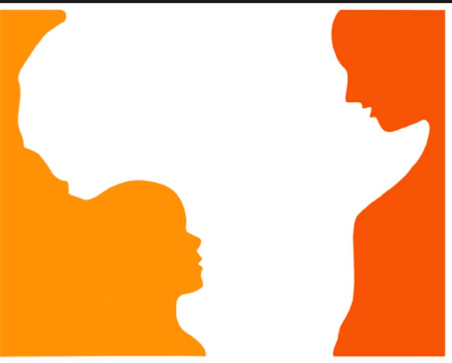
Hope for African Children Initiative
At first glance, this logo appears to simply be the geographical outline of Africa. If you look more closely, you can see that this outline is actually created by the contours of two people – an adult and a child.
Beats
The logo for Beats by Dre is pretty simple. The ‘b’ is enclosed in a circle followed by the brand name. The circle, though, isn’t just a circle. It actually represents a human’s head, and the ‘b’ letterform represents the brand’s headphones. This gives the brand a personal element, allowing a customer to see themselves in the headphones.
Mobil
Mobil’s logo itself does not represent anything, however, the colours do. The red represents strength while the blue in the logo represents faithfulness and security.
First Bank
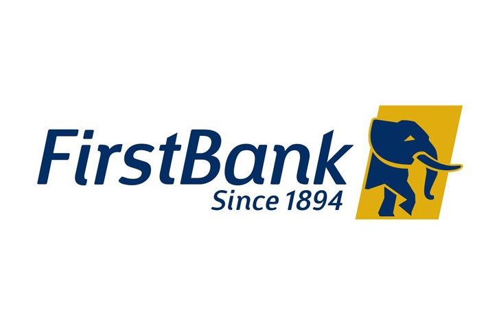
The raised head of the elephant in First Bank‘s logo signifies the banks’ commitment and the promise to their customers on every financial challenge they face– they can face the challenges with their head held high. The deep blue colour on the logo represents momentum, innovation and evolution. Additionally, the raised foot of the elephant signifies the bank’s promise to always put their best foot forward for each and every one of their customers.
As regards the use of colour, the gold colour on the logo identifies with value and serves as a reminder of the inherent value and durability of First Bank as gold is a precious metal. This also is a promise made by the bank to continue to set the gold standard of value and excellence in financial solutions across Sub Saharan African region.
Ventures Platform
Ventures Platform invests in visionary founders, who exhibit grit and have a mission-driven approach to solving real problems in Africa. The logo is a combination of black and white which are two classic colours. Black for Ventures Platform represents the strength of mind, will, and character.
While white is safe and open–indicative of the environment the company created for startups to thrive. White is also blank, like a canvas – space to build the future. The logo is shaped like a funnel because the intention of the company is to filter and guide the best ideas and support them to scale.
Paystack
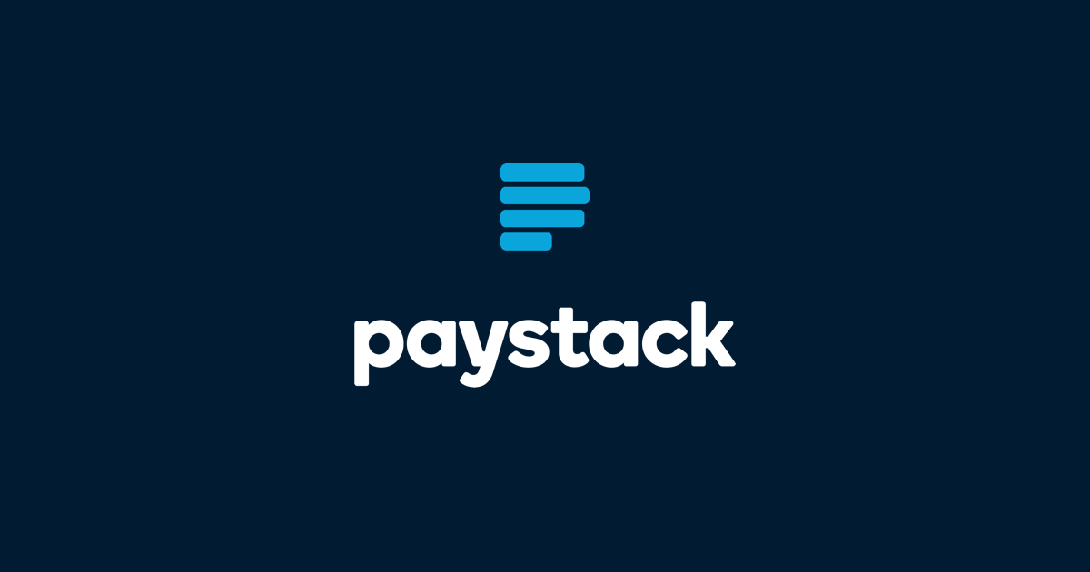
Paystack helps Nigerian businesses accept payments from anyone, anywhere in the world. The name Paystack fit tight and snug into the concept of trust. A stack seems like an easy thing to create. The trust part was ironically the easier part, the stability of an organised stack would have a trusting presence. The company maintained the use of the letter “P” from the old logo and converted it to a stack in this new one, so once you see it you just get it. What is familiar is easy to perceive and trust.
Max
Max is on a mission to fix Africa’s last-mile delivery and online-retail problems by using mobile and web platforms to connect consumers, retail businesses and independent drivers in real-time. The Max logo has been creatively designed such that it contains all the spellings of max. A closer look at the white space will reveal the infinity symbol which depicts the length at which the company delivers on promises made to its customers.
Never miss an important story during the week. Subscribe to smepeaks weekly newsletter now.

